
- 1st Steps
- My Process
- The Project
- Going Live
- Projects
- Estimates

In today’s marketplace, people need websites, and I build them. Hi. I’m Chris — the “c” in cdeatherage.net.
You’re probably wondering — given the seemingly relative ease with which websites can be launched and the legions of designers and developers out there ready to address your Internet needs — why you should contact me to help create your solution. The reason is simple. It’s the personal approach I take with all of my projects.
I like working with and getting to know creative people. And when I help them design and develop their websites (or redesign and redevelop them as the case may be), I make it a point to get to know them. Their personality. Their passion for and dedication to their work. How they interact in their world. What they like and dislike about websites in general and their own (if they have one) in particular. Hopefully, when the project is finished, their Internet visitors will discover through the website the same bright talents that I strive to express in the language of The Web.
Next: My Process
I’m a big fan of clean, simple websites that are user friendly. What I mean by that is that the necessary form and function are dressed neatly, appeal to the eye, and are structured in such a way that the site’s visitors can find the information they seek with minimal effort.
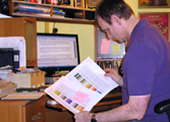
Effective websites require careful planning and attention to detail. The first step in this process is our initial consultation where we speak at length in order for me to discover not only what your website needs to accomplish and communicate but also what interface elements you like and don’t like. This two–way communication is critical, as I cannot be an effective developer without clear information and feedback from you. And it’s OK if you don’t know how to express what you have in mind. I’ll just keep asking questions and trying different approaches until we achieve what is going to work for you.
After that initial consultation, I’ll digest the information we’ve shared and put together some ideas to present and discuss at a second meeting. The presentation will outline the scope of the project as I have understood it, present concrete ideas for moving forward, and offer a “best guess” estimate regarding the time to complete and implement as well as cost. [Bear in mind that quite often, the time to develop a website thoroughly and correctly may exceed my estimate due to new considerations and unforseen detours that will inevitably crop up.] Following that meeting, we will decide whether to go forward with the project or not.
Next: The Project
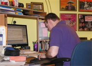
Once we have mutually agreed to go ahead with the project, I will set to work coding your website, incorporating current best practices to build your Internet presence according to the direction we have determined. In executing your website, either you will provide me with all of the necessary content or I may develop that content for you. For example, I may ask you to provide me with physical copies of original materials which I can convert to a digital file for placement in the website. I may need to create, retouch, or alter existing graphics for optimum exploitation on your site. Or you may run across or develop materials independently from me that you want incorporated in a particular section.
As the project develops, I will stay in contact with you either in person, by phone, or via email because developing any website is a collaborative and organic process. The more information I have at the outset and throughout the process, the more effective I can be. Again, communication is crucial, and while there can be limitations to the underlying code of a web page, I do not necessarily believe anything should be considered “set in stone.” My goal is to help you achieve an optimum web presence for yourself or your business, and I will make every effort to ensure that happens.
Next: Going Live
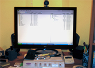
Generally speaking, the development of your website will happen “locally.” That means all of the new files will be created and saved separate from any existing web pages you may have already published to The Web. That is to say, if you have an existing website, no changes to it will be made until the new content is thoroughly vetted and approved.
If you need to secure a host server, I can make recommendations and help you establish the account. I will upload the new files to your host server and fully test them to make sure they function as designed in all current web browsers. I can also help you set up email accounts, if necessary, and work with you to maximize search engine optimization.
Next: Projects
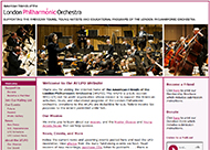
http://www.aflpo.org
A colleague from one project in which I was involved recommended I pitch my services to the American Friends of the London Philharmonic Orchestra, a non–profit whose mission is to support the American activities, tours, and educational programs of the LPO. I met with the committee, and other than having a custom logo and the ability to co–opt elements from the LPO’s UK website, everything for aflpo.org had to be built and developed from conception to launch. Obviously, the pitch was successful, or I would not be writing about it now. I collected ideas of what was envisioned and presented samples of existing websites that offered some or all—or none—of the elements to meet the AFLPO’s needs. We settled on a basic design, assembled the content, and chose a visual style that would be in harmony with the AFLPO logo and the LPO’s brand identity. It proved to be a really robust and fun project.
Back to Top
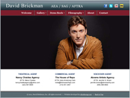
http://www.davidbrickmantalent.com
David Brickman, a self proclaimed “theatre brat” and third–generation actor, contacted me about totally redesigning his website. His career was developing in new directions, and he needed to ensure that his brand image reflected those directions. He also needed a website that didn’t drive visitors away. Everything was outdated—incorrect (and oft times repititious) contact information, clearly dated photos, an extremely user–unfriendly interface for reviewing his demo reels. When I first viewed the site, I had to agree that it looked “like a big mishmash and not very organized.” The HTML contained deprecated code, styled elements that were out of alignment, and copy which butted up against images giving neither room to breathe. We wiped the slate clean to give the site a sleek, modern look that is easily navigated and drawing visitors in by focusing on current information. We edited the photos down and arranged them in fluidly viewable galleries. And we maximized the media elements by embedding YouTube–hosted videos and a media player for instant play of the voiceover reels. Visitors now encounter a professional–looking site and quickly understand who David is and what he does.
Back to Top
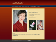
http://www.evilgael.com
Gael Schaefer contacted me to help move her existing website, evilgael.com, from one economically–hosted service (which was voluntarily shutting down) to another. Before we met, this talented character actor and fight choreographer had started to explore Weebly.com and had pretty much begun laying out a new site using one of its standard templates. We did consider several other options but ended up sticking with Weebly because most of the work was done (and we had to be mindful of the impending end date for the old site). Working with Weebly’s design tools, I fleshed out the pages Gael had started and began uploading new content into additional pages that she required. I arranged photo slide shows of her headshots and production stills—some of which repeat as illustration on other pages. Lastly, I edited the template’s style sheet, adhering to Gael’s preferences of “no all white, no all black, and no sans serif fonts.” Customization included designing and implementing a unified color scheme, setting backgrounds with either solid colors or gradients, and making sure that Times New Roman was the first font choice.
Administrating the actual switch from old host to Weebly and the new URL registrar took extra time. A number of emails over the course of several days were required to actually move the domain name registration from the expiring service and get the URL mapped to Weebly. Once those two tasks had been completed, we were able to set up the new email account and publish the new site. A couple of tweaks later, Gael is thrilled with her new web presence, and I am impressed by how user–friendly Weebly proved to be.
Back to Top
http://www.justimaginenyc.com
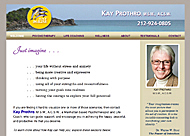
JustImagineNYC promotes the work of therapist and life coach Kay Prothro, MSW. Kay came to me initially to teach her how to update the site herself and ended up hiring me to do the work instead. The original site was textually cluttered and in a rainbow of color. With a simplified color palate and clean visual layout, the site no longer looked like a word processing screen circa 1985. We have updated the site several times since that first do-over, introducing new content and minor cosmetic changes at every stage. Most recently, we have paired a redesigned dolphin logo with a thematic ocean photo and have incorporated a grid–based structure on each page to draw attention to Kay’s services and expertise. [By the way, Kay’s fabulous new portraits were shot by Nicolai Grosell and very lightly retouched by me.]
Back to Top
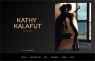
http://www.kathykalafut.com
When fashion stylist Kathy Kalafut sent me some new work to mix into her portfolio website, we took the opportunity to tweak the overall design and re–code the galleries by substituting Jquery for Flash. Initially, Kathy had sought me out to code her website after seeing the one I had done for Tom Booth, a photographer’s agent (who has since retired). She had already determined the basic design, so all I needed to do was size the images and write the HTML code. I think she would agree that my biggest contribution to her site was in retouching her images. Most had been scanned from tear sheets, and the quality was not optimal. I repaired many elements, merged disjointed spreads into single images, removed text, balanced the levels between highlights and shadows, and corrected color balance. [One “before and after” example can be found on my Digital Imaging page.] In the latest round of updates, I merged two versions of the same image; one had been retouched and the other had not. When Kathy saw it, she wrote to say, “You did a fantastic job saving the crosswalk shot!”
Back to Top

http://www.lessstressbusiness.com
When my friend, Dan, contacted me to say he’d recommended me to a colleague who wanted to integrate her website with her blog, he said, “You two will have a lot of fun together.” And he was right. Jamie Sussel Turner is a lot of fun to work with. Together, we we shared a lot of laughs evaluating what this New Jersey–based business coach wanted to salvage from her previous website and how she wanted to communicate new content. Jamie picked a WordPress theme that she liked, and we just ran with getting the transfer done.
In setting up her pages, I customized colors and backgrounds in the style sheet, converted press articles and professional essays to PDFs for easier sharing, and helped her choose stock images to enliven the new pages visually. I also rejuvenated the old family photograph on her “10 Fun Facts” page. Probably the most important new element is the banner image I based on her business card. (Yes, we had the darndest time finding just the right orange to contrast the blue!)
In time, Jamie turned her blog posts into the smart, well–received primer Less Stress Business: A Guide for Hiring, Coaching, and Leading Great Employees. In bringing the book to press, Jamie worked with a graphic designer who created the book cover and other branding collateral. A couple of months before the publication date, jamiesusselturner.com was rechristened lessstressbusiness.com, and I used the graphic designer’s color and style palattes to match Jamie’s WordPress website with the new branding identity. And this time around, the graphic designer had done the hard work of matching the orange to the blue.
Back to Top
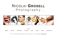
http://www.nicolaigrosell.com
Nicolai Grosell is a beauty, still life, and portrait photographer whose website I redeveloped to showcase the entire range of his skills behind the camera as well as drawing focus to his marketing brand. This Denmark native is known for images that capture a rich interplay of light and shadows, and his website reflects the clean, crisp elegance of his work. Many, but by no means all, of the images have been retouched by me; most just required a light cleaning because of how good they are out of the camera. Other contributions include designing the graphic image that illustrates the Stock page and the Jquery animation on his bio page (where his visitors can view and print a comp card and client list that I created). Recently, Nicolai asked me to add a Travel gallery to showcase some of the real world images he has captured on trips to Central America, Europe, and Southern Asia. And we have also expanded the Portrait gallery with his evocative black–and–white “Blue Collar Men” series.
Back to Top

http://www.patriciayoungquist.com
This project, for the impressionist photo artist Patricia Youngquist, started out as a simple request to add text and new greeting cards to the collection already being offered for sale on the site. As we began working together, however, we saw that the structure from which we were starting was a disorganized, confusing mess camouflaged by a somewhat slick (but definitely) pre–packaged interface. In short, it was an e–commerce site that offered visitors no call to action. We rather quickly changed the gameplan from “update” to “redevelop,” turning the website into an effective showcase for her emotionally charged impressionist photo art and uniquely vibrant greeting cards. Most recently, the site has been expanded to include Patricia’s video art, Virtual Stories.
Our first step was to re–brand the site as an exclusive, Internet only art gallery whose bricks–and–mortar equivalent can be found anywhere from Manhattan’s Upper East Side to Soho. By extension, the site then became the sole point–of–purchase for her greeting cards and impressionist prints featured in the more clearly defined Storefront. I also took on the task of composing or re–writing the copy to reflect the new marketing message. And though I created the illustrations which introduce a section or page, I think Patricia’s favorite graphic elements are the “add to cart” and “check out” shopping bag icons I created for the Storefront.
Patricia and I both are very proud of this complete overhaul, and Patricia has also sought my advice in the development of her blog, www.thelastleafgardener.com.
Back to Top
http://www.phianyc.org
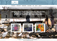
Sometimes, a new job happens because someone knows you from a previous job. That is how I came to be involved with Presbyterian Hope in Action, a non–profit formed in the aftermath of Superstorm Sandy to help rebuild affected communities. PHIA had a live WordPress website which was little more than a skeleton, both visually and informationally. PHIA needed to up its profile and raise awareness, get volunteers involved, and make it easier for visitors to pledge donations. A start to re–making the site using a fresher–looking template was only half completed. Could I finish the project for them? Absolutely! As we began working together, a new direction for the website was developed, with the focus less on PHIA and more strongly on connecting people to people, rebuilding lives, and rebuilding homes. I am proud to have had the opportunity to help this organization rebuild its web presence.
Back to Top
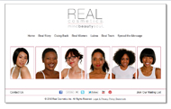
http://www.realcosmetics.com
Lubna Khalid created Real Cosmetics to provide real make–up for women of all skin tones and to use the company as the foundation for promoting self–esteem and empowerment to women everywhere. She asked me to critique the company website because she felt it was outdated. It contained Flash elements (which could not be viewed on some smartphones); content—which needed to be updated or eliminated—that was not breathing on the screen because it butted against images or container edges; a “learn more” element that blocked access to other elements on the same page; and users could only navigate into a new area by returning to the Home page.
We made some quick fixes first. Outdated or incorrect information was replaced or removed, and padding was added around text and images to clean up the pages visually. After all of the temporary changes were complete, we focused on more permanent solutions while working with the same basic design of the original. First and foremost was a complete navigational menu replicated on every page. Content was fleshed out to communicate more of the story behind the company. Flash animation was replaced with several Jquery plugins (cycle, slideshow, spritely). Fresh still images injected a new vibrancy, as did expressive images of Lubna engaging people and visiting places all over the world. Links to social media were added. With each new change, Lubna’s first comment was always, “Looks fantastic! So exciting!”
Back to Top
http://www.rosamountainhouse.com
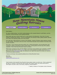
When designer and quilter Patricia Rosa contacted me about helping her launch RosaMountainHouse.com, she had pretty much figured out everything she wanted in and needed for the website. What she didn’t have was someone to write the code for her.
Working from her design layouts, we drew upon the colors of her original Rosa Mountain House illustration and crafted a simple site that functions beautifully as an online brochure for her quilting retreats in Upstate New York. I think the hardest part of the job was finding the best code to display images in the photo gallery.
If you are a quilter, I think you’ll thoroughly enjoy a quiet, cozy weekend retreat at Rosa Mountain House.
Back to Top
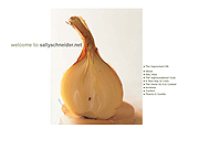
http://www.sallyschneider.net
This is the official website of Sally Schneider, creator of ‘the improvised life,’ a lifestyle blog, and author of the IACP and James Beard Foundation award winning The Improvisational Cook and A New Way to Cook. Sally and I worked in close collaboration to create this site and took great pains to make it as uncluttered and user–friendly as possible. We think it still looks amazingly fresh and vibrant, though it is “ancient” code–wise. You may notice that we borrowed liberally from the art direction of both books, theorizing that visitors would more easily connect the site with the books on bookstore shelves.
Back to Top
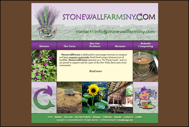
http://www.stonewallfarmsny.com
I was introduced to architect Trevor Schultz at a summer party, and in the course of getting to know each other, I began to learn of his passion for using low–tech infrastructures such as solar energy, reclaimed rainwater, and compost toilets to create, support, and sustain our environment. Trevor was at that time in the beginning stage of turning Stonewall Farms, his property in upstate New York, into a sort of laboratory where “zero waste” initiatives are practiced and promoted. A big part of his initial operation is the making and selling of his “Feed Dora” Bokashi composting and composting supplies. We met again, several days after the party, to discuss how he could market both Stonewall Farms and the bokashi through the website he had designed in his head. Together, we refined his ideas, sharpened the content copy, and married color, illustration and photographs into the simple user–friendly site I hand coded.
Back to Top
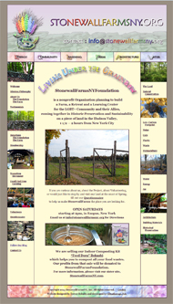
http://www.stonewallfarmsny.org
A few months after we launched StonewallFarmsNY, Trevor contacted me to say he was ready to launch a second website as a companion to his first. Where StonewallFarmsNY.com promotes a commercial venture, StonewallFarmsNY.org focuses on a non–profit foundation dedicated to building a retreat and environmental learning center for the LGBT+ Community and their Allies. Here, short– and long–term visitors can experience living “off the grid” or volunteer to help run and manage the daily life of the farm. It is a place in which to learn about reducing energy use, cutting down on waste and material costs while simultaneously practicing natural conservation and working toward a low–carbon footprint. For this site, we played off the design and development of its older sibling while shifting focus ever so slightly toward a rainbow of pastel hues.
Next: Request an Estimate

As a rule, the fees I quote are based more on the project than on a fixed line–by–line basis, and I am more than willing to work with you if you come to me with a set budget. So much time, energy, thought, and talent go into designing, building, developing, and maintaining a website that I find charging for each specific detail a little ridiculous. I have actually seen a web design contract that itemizes every possible “nickle and dime” that can be charged, and that’s not me.
Final Terms and Conditions will be stated in full in all formal quotes. For more information, please call or send an email to set up a consultation which is the first step in developing your cost estimate.
Contact Phone
917.863.6068
Contact Email
info@cdeatherage.net